|
The Spirit of Interior Design
Building an Organic Color Scheme
By Eileen Wosnack
One of the difficulties with natural products is that they come in natural colors, which some feel to be bland. Now, there is nothing more beautiful than nature with the lush and rich tones and hues that arise spontaneously from animal and plant life, but these are not generally the colors we think of when we think natural design.
For example, the color “natural” is exactly what there is to choose from and all there is. Organic wool comes in the shades of the sheep as does cotton come in the shades of the fiber. If you enjoy tone-on-tone neutrals and shades of beige and light brown, then organic fibers and fabrics will be exactly perfect, but if you have a craving for the intense and vibrant shades, good luck! How to create a colorful organic home is a conundrum for some.
Organic bedding constructed from organic cotton, natural hemp, linen, bamboo, soy, and silk generally comes in the natural color of the fibers or may be bleached with hydrogen peroxide – a safer whitening alternative – to produce a lighter, almost white tone. Naturally colored wool is black, brown, beige or whitish and color-grown cotton can be a light green, brown or beige. Tussah silks like Dervish cloth are actually close to a milk chocolate shade, however; most other shades are derived from dyes.
Indigo produces a rich, deep and dark blue and can be common in fabric choices. Other natural dyes tend to be more expensive, more difficult to find, and more difficult to maintain.
The choice to hand-dye fabrics is always there, or even possibly machine-dye them, though organic dyes may take days to produce the full colors they are meant to show. Fiber-reactive dyes, though considered safer than some other types, can still be hazardous to workers in the production and in use, especially when inhaling dust from the dyes. Even traditional organic dyes need to be used with caution and can be absorbed though the skin and lung tissues, causing a multitude of differing symptoms in individuals.
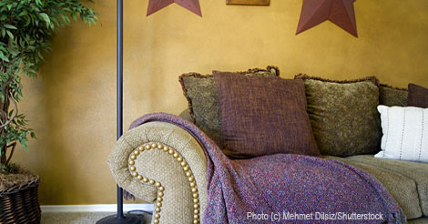
So, in the absence of strong color in organic fabrics, where does the vibrancy and variation come from for an intensely-hued color scheme and how does one go about creating the magic that color brings to warm a home? Paint is a wonderful material. Organic paints do not contain any petrochemicals and remainders may be composted. Through the addition of earth pigments, paints come in any color you wish to create. Ochers and oxides, when combined with oil or water and filler such as clay, can provide the basic color for a room. Embellishments of mica powders can even add true sparkle and a glaze of oil or wax will preserve the tones, while protecting the paint.
To create a color scheme, first choose the wall paint in the desired color in either the water or oil base. Keep in mind the tones of the woodwork and of the floor and select a hue that is in the same family, either warm or cool, or contrasting.
Generally, children love vibrant, even shocking colors, while older adults prefer a more subdued hue. Warm colors do not have to be red, yellow, or orange but, instead, they will have a golden base to their appearance. There are warm blues and greens just as there are cool reds and pinks. The “feel” of the color is important and to create a wonderful color scheme, compatible tones of warm or cool are best. Leave the mixing of those tones to a professional, because it is difficult to introduce both warm and cool spectrums and still have a unified feeling.
A patina finish in the natural paint may be achieved in the traditional sense from films of thin coats resulting in a bit of mottled, layered wall finish with incredible depth. Only one color is required for this ancient, beautiful finish but when layered, transparent paints in related colors also can be stunning. Once the wall color has been selected and applied, your accessories can be chosen to compliment or contrast with the base color.
The general decorating rule is employing mostly a main color and then using contrasting color in a stronger version for accents only. Avoid half-and-half color schemes. The eye needs to rest and find some relaxation, but in a mix of two strong opposing colors, there is no place to find release from the sharp contrast. Subdued colors can work well, but so can one subdued and one stronger one. Consider it a sliding scale so that the stronger color is the least used and main color is more prevalent and subdued. Then as one decreases, the other increases and vice versa.
Once the walls are painted and the secondary color chosen (if there is one), the color scheme should be set. In analogous color schemes, several very closely related colors in similar intensities are best with accessories of either neutrals or one of the shades chosen. Warm analogous colors would be something like orange, coral, golden orange, golden pink, and warm white while cool colors would be red-based blue, turquoise, cool green, and aqua. Do try to stick to the warm or cool colors, without mixing them, for easier decorating.
For splashes of natural color, plants are always great options. Green goes with everything and there are many plants with colorful flowers that would compliment your decorating scheme. Colored glass, especially recycled and diffused glass, offers a myriad of intensities for accessorizing. Porcelain and pottery vases, Talevera tiles, and art pieces come in a rainbow of colors, as do fine art paintings and colored photographs. Choose items that have a shade of the wall color in them or compliment the whole color scheme. Even in a neutral color scheme, introducing found items in colors that set your spirits alive is a great option.
To create a natural color scheme, stick with the naturally organic colors and use paint and accessories to introduce the colors in the room. Then without endangering the environment or compromising the health of the workers who produce the products used in our homes, a perfectly wonderful house full of the colors of the rainbow can be created. Who says organic is bland? Not a chance!
Eileen Wosnack is the principal designer of Spirit Interior Design in White Rock, British Columbia and founder of Eclectrix™ Organic Home, a sustainable organic interiors store. She is a member of the Canada Green Building Council and the Organic Trade Association. She is also an educator and speaker.
|